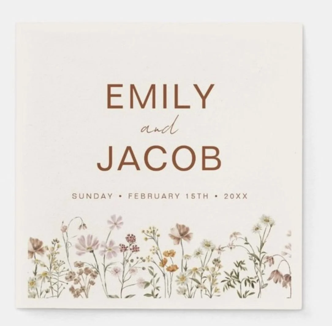
Brittany + Ryan
11.15.25
Wedding Design
Inspiration
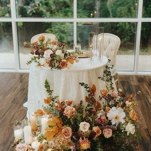
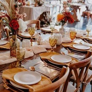
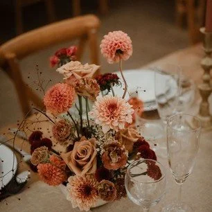
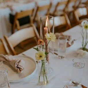
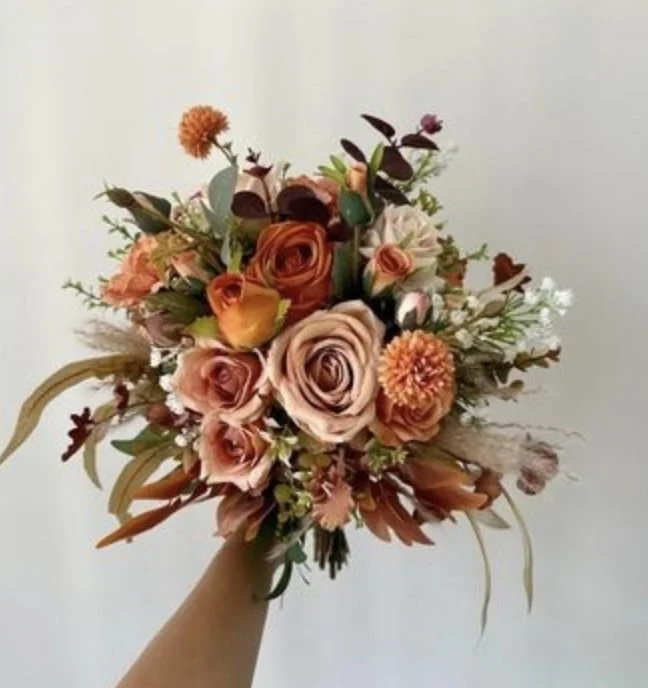
Color Palette


Timeline:
August 25th: Design Process Begins
October 10th: order Memorial, Dress, Gifts & Cards, & Bar Signs
October 20th: Order Seating Chart
October 30th: Ship all items
November 15th: Wedding Day!
Wedding Day Items:
Keepsake welcome sign
signage for the dresses
Memorial table signage
Seating Chart
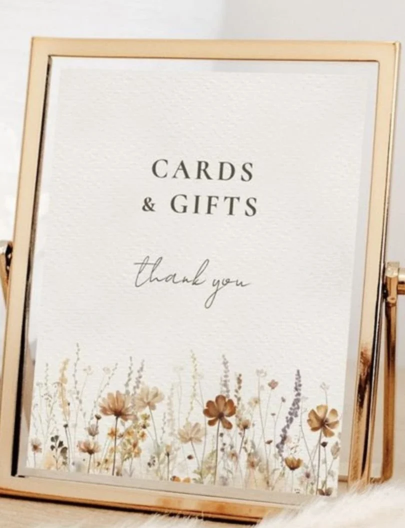
Cards & Gifts sign
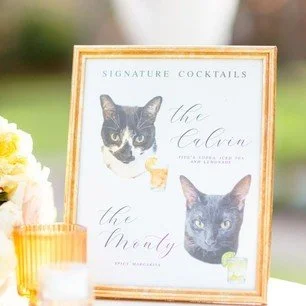
Bar Sign (Featuring Pushkin)
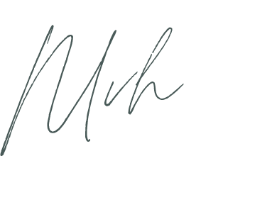
Fonts:

Vision:
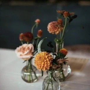
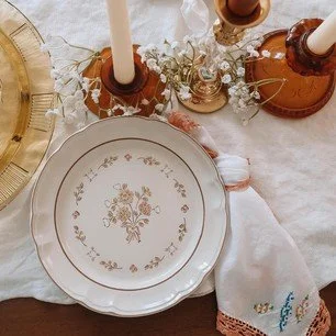
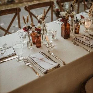
natural elegance
minimal wildflowers
mountain silhouettes
warm and comforting
cozy mountainside cabin
gold foil
creams instead of whites
wooden tones
Simple Clean edges
keep everything cohesive
Wooden borders (possibly frames if needed)
Possible gold wax seals to add detail
Seating Chart
24” X 36” Matte Foam-Core Board

Bar Sign
8” X 10”
Printed on 220# Felt Cover (very thick textured paper)
Color: Warm White
Text: Dark Brown
2 Copies Printed

Gifts & Cards Sign
8” X 10”
Printed on 220# Felt Cover (very thick textured paper)
Color: Warm White
Text: Dark Brown
1 Copy Printed

8” X 10”
Printed on 220# Felt Cover (very thick textured paper)
Color: Warm White
Text: Dark Brown
1 Copy Printed
Dress Sign

Memorial Table Sign
8” X 10”
Printed on 220# Felt Cover (very thick textured paper)
Color: Warm White
Text: Dark Brown
1 Copy Printed

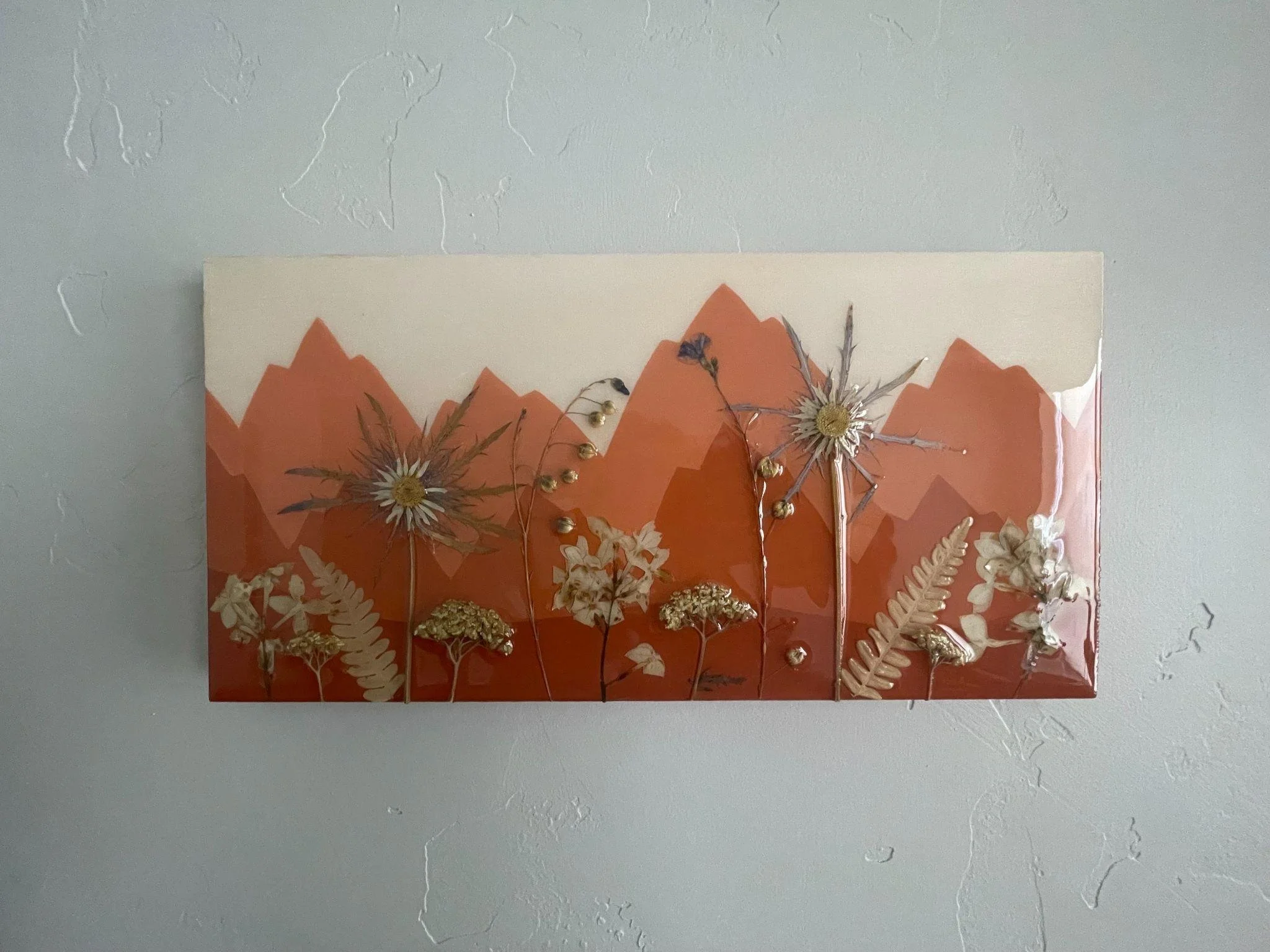
Welcome Sign
24”X 36”
Dark Stain Frame
Dark Brown Text
Slightly off-white/cream background
All caps names with full wedding date
Mountains and details added after print

Dark Stain

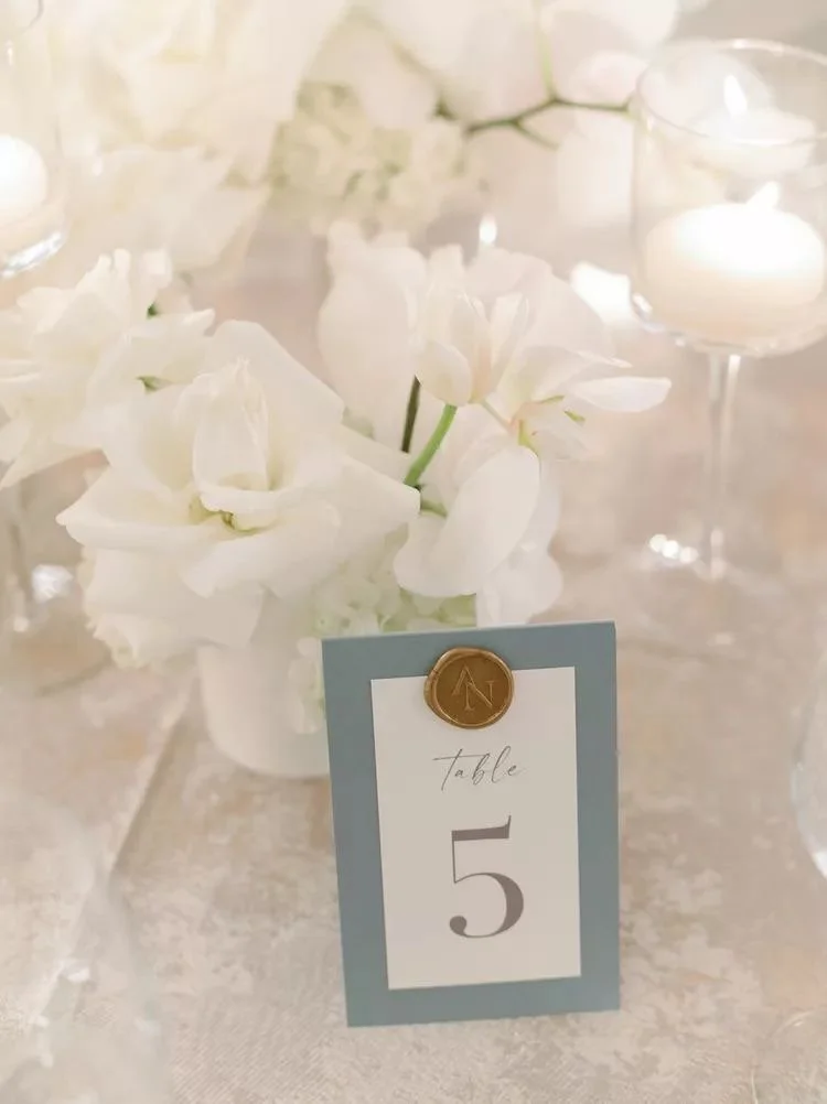
Table Number Idea:
For your table numbers, I’m envisioning a blend of the two inspiration photos shown below. We could mount a beautiful cream-colored paper onto a wooden background and finish it off with a gold wax stamp for an elegant touch. My sketch is just a rough idea, but it helps show the direction I’m thinking. Once we’ve nailed down the overall display style, I’ll be able to create a variety of design options for the actual table number paper itself.

For your keepsake welcome sign, I’m envisioning a framed canvas. I know you mentioned you weren’t sure about having a frame, but I think this option would give you the most polished look while still keeping that true canvas feel. The frame also helps finish off the edges nicely, especially with the torn paper detail, so everything looks intentional and elevated. Since the artwork wouldn’t be behind glass, you’d still get the full effect of the textures and layers. I can share some examples if you’d like!
To give you a better sense of what I have in mind, I put together a very rough sketch. This is just a loose idea and not at all a reflection of the final piece—it’s simply to show the direction I’m thinking.
For the artwork itself, I’m picturing layered watercolor and acrylic-painted paper with the possibility of subtle gold accents. We can include your names and wedding date to keep it timeless and versatile so it can easily be displayed in your home afterward. The colors would reflect your fall palette, with lots of warm neutrals woven throughout.
Welcome Sign Idea:


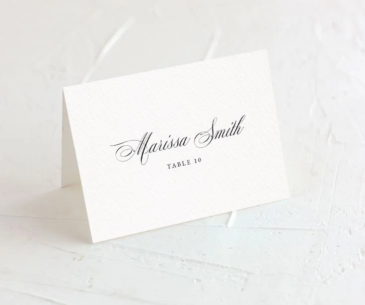
Place Cards Idea:
For your place cards, I’m envisioning cream-colored paper with dark brown text, possibly accented with a small illustration in the lower corner

For your programs, I’m picturing cream-colored paper with dark brown or maroon text and elegant gold accents. We could incorporate a mountain or wildflower illustration in gold as well. The example shown is just a simple version of what’s possible, the sky is the limit!
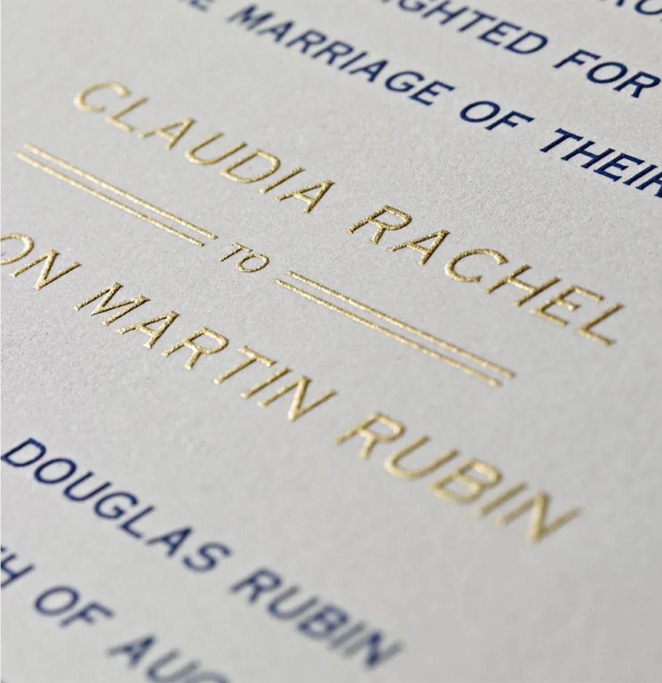
Do you prefer the look of gold foil or thermography?
Gold Foil vs. Gold Thermography
Gold Foil – A thin metallic foil is heat-pressed onto the paper, giving it a true shiny, reflective finish (like real gold). It’s smooth to the touch.
Gold Thermography – This process uses special ink that’s heated to create a raised, textured effect. It has a softer metallic sheen (not as reflective as foil) and you can feel the raised design when you run your fingers over it.
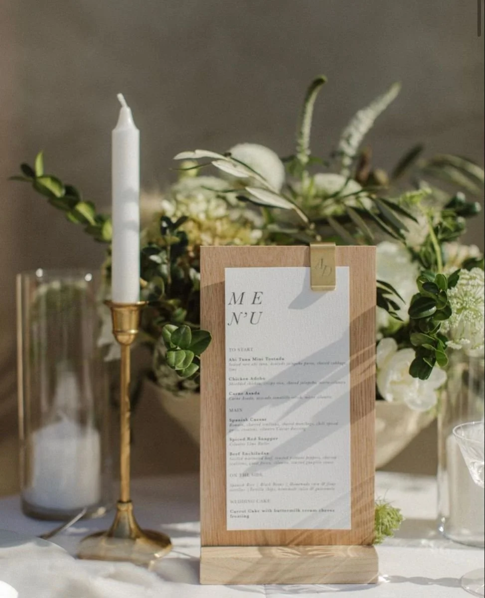
Programs Idea:

Foil
Thermography
Remainder of Signage:
Dress Sign, Memorial Table, Find your Seat, Gifts & Cards, etc.
For the rest of your signage, I’m envisioning cream-colored 220# double-thick textured cardstock displayed in small wooden holders (see example below).
To add extra detail, we could include sketches of wildflowers or mountains on each piece.

